My Dear Friends,
Hope all is well with you and that you’ve learned something about color and how to mix paint to achieve your desired color.
Today I’d like to bring your attention to a couple of items that are sometimes disregarded or just plain unaware that they have anything to do with a satisfactory outcome of a painting.
Now that we have the fundamentals of mixing colors, we should know some of the properties they hold. Like warm and cool.
Aha! you say, I know that. Sure there are warm colors like red, yellow, orange, as well as cool colors like the array of blues.
However, simply put the “temperature” of colors plays a big part in your overall scheme. Paul Cezanne, the famous French impressionist painter, came to that conclusion and demonstrated that in his paintings.
It is said that he would spend a great deal of time studying a particular scene to determine the exact warmth or coolness of a color that would best place that object at the right distance from himself.
In other words, he discovered that the “cool colors” tended to recede in the background. While the “warm colors” tended to come forward. This created the illusion of “depth” in his painting.
I said above that some artists are unaware of this phenomenom and therefore don’t utilize it. Their rationale is that “a tree in the distance is the same color green as the one closest to me and therefore I will paint it the same color green”. However, had that color been “cooled” down with a daub of a blue, indeed the illusion of depth would put the tree in the distance its rightful place.
Likewise for the objects in the foreground. A little daub of cadmium red light will not only “soften” the color but also add “warmth” to it as well.
The other item I’d like to touch upon is Composition.
Too many people are just plain unaware of how much this plays in the overall painting. It’s also known as “Division of Space”. It’s how we divide our given canvas.
Rule No. 1-- Never...never place the focal point of your painting dead center. It sets up a static realtionship and draws the reader’s attention to it while disregarding the rest of the elements.
Rule No. 2-- Never put the horizon line smack in the middle of your page. It divides the page in half and both halves “compete” for priority.
Same goes for a vertical divide.
Rule No. 3.-- Never run a line, such as a roof edge for instance, into a corner of your canvas. It’s just bad.
For the good stuff, there are a few acceptable forms of composition. Namely, the “L” composition. either left or right side.
The “Horizontal” composition. Here you will place your horizon line below center. Example, a beach scene. If there is a wonderful array of cloud formation, then you would want to have less sand and more sky. Conversely, if there is something of attention on the beach, you would want to have more sand and less sky.
Okay, that’s it for today. I think you have enough to whet your appetite to start cranking out some meaningful strokes with your palette knife.
--Adam
Tuesday, December 9, 2014
Sunday, December 7, 2014
Day three
How are we doing do far?
Yesterday you got your feet wet with mixing a little color. Today we’ll delve a little as to where these mixed colors came from.
Before we begin I’d just like to share with you my adversity about using paints straight from the tube. It’s true that manufacturers like to show off their ability to impress you with a variety of colors so that you spend less time mixing and more time painting. Don’t get drawn into buying unnecessary colors that you could do a better job yourself in mixing yourself.
That’s why I use and recommend a limited palette-- two reds, two blues, two yellows, white and black. Or, you can mix your own black using Prussian Blue and Burnt Umber. You can also squirt a little Payne’s Gray on your palette as a black substitute. But note that Payne’s Gray is a very dark BLUE, that looks like black, but it’s not. Just mix it with a little white and you’ll see.
When I say two of the three primaries, I mean a Cadmium Red Light / Alizarin Red; Yellow Ochre / Yellow light; Cerulean Blue / Prussian Blue. You can also use Cobalt Blue, too.
If you recall back in grade school someone showed you a Color Wheel. There are a number of various color wheels on the internet. Just Google the word and you’ll get a plethora of websites. Open one up, print it out, if you like, and study it.
I know you remember that blue and yellow make green, and red and yellow make orange, and red and blue make purple.
But what do you get when you mix purple and yellow? Or, blue and orange? Or, red and green? These are opposites on the color wheel. Hmm.
Actually, they each produce a neutral color. The same color. It’s how they become compatible because they each have something of the other.
Some might think color wheels are just theory and not of any help. When you start mixing from that limited palette you’ll better understand how color works.
I’m not going to take you by the hand to mix the colors for you. It is YOU who will acquire the skills of mixing, only by doing it yourself. I can give you the heads up, but you are the one who will put it into practice.
So, that is the challenge I put before you today. It’s not difficult, rather fun and exciting as we learn new things.
--Adam
Saturday, December 6, 2014
First Exercize
--please scroll down for the introduction--
How did you make out with your exercise on painting with the palette knife? Were you able to apply the paint like frosting a cake? Sometimes a person who has used nothing but a brush in their paintings, have difficulty in switching the brain to accept the concept of painting differently. So, you’ll have to make a conscious effort to make sure you are applying paint with a knife and not with a brush.
Were you able to see the video from Michael Pintar? It was fascinating to watch how he went from “nothing” to the Italian street scene. And how he deliberately placed colors in seemingly random places, only to wind up as being perfectly placed to achieve his desired goal. Wow! whadda show!
With that said, today we’re going to embark on doing some meaningful strokes. You may click on the image below of the Geese. This was the second painting I did with my new found friend, the palette knife. If you are able, you can copy it and print in out as large as you can. I want you to copy what I did. Your version won’t be stroke for stroke, because it will be yours.
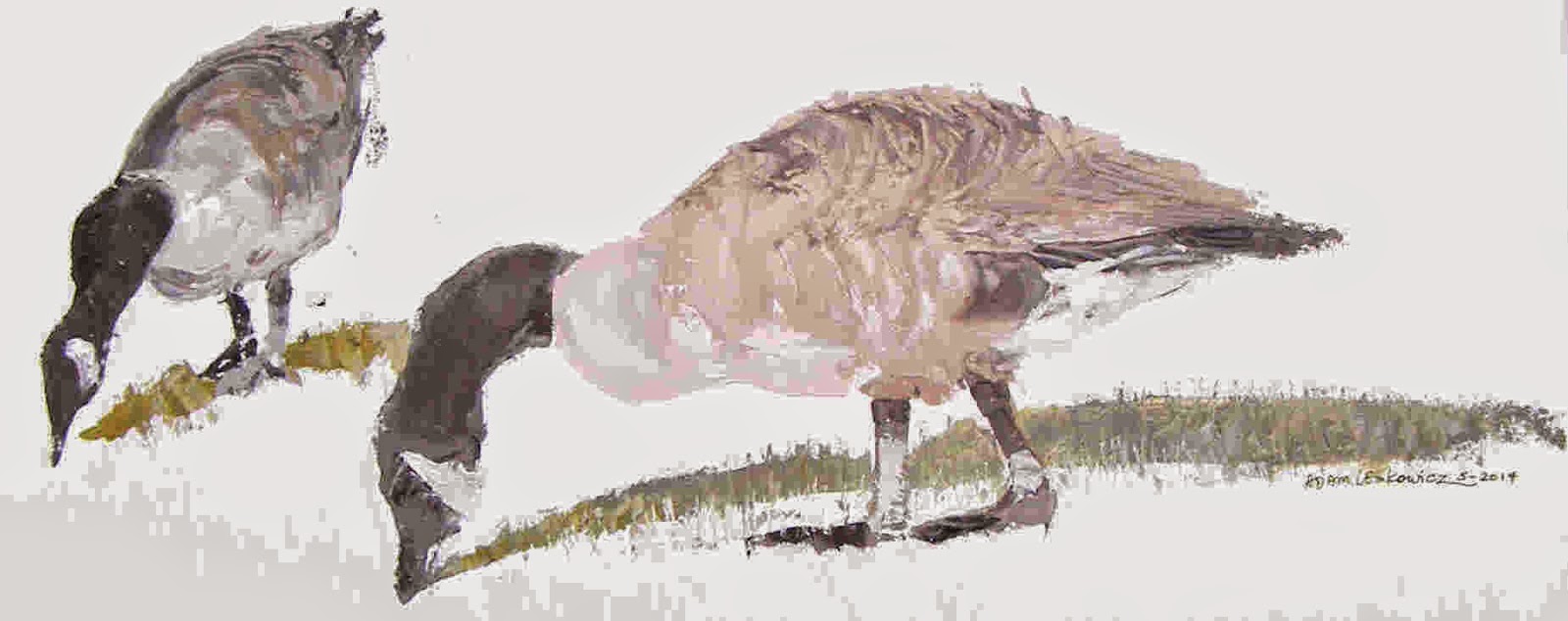 What I want to draw your attention to are the three parts of the goose-- the head, the body, and the feet. The rest is superficial.
I mixed a small portion of Burnt Umber to a blob of white, adding a small pinch of Cadmium Red Light to “soften” the color, and probably a little Yellow Ochre. You can experiment yourself with proportions.
Then, when I did this one, I created the shape of the body first, usint my favorite knife, the black-handled one. I loaded up the blade, started at the base of the neck and drew the flat of my knife toward the back of the bird, made the hump, and drew down to where that color ended. I then carefully noted the shape of the underside of the bird and followed that contour.
People ask if they should first pencil the outline in first. You can if you want, but I wouldn’t recommend it. We kinda get “married” the the outlines and miss out on seeing the overall shape.
Of course, placement on the canvas plays a role in the overall finished product. So be aware of where you’re putting your first stroke.
One of the benefits of drawing with a palette knife is the ability to see the larger picture. Let me explain.
An idea comes to us in our brain. We visualize it and begin to see all the intricasies associated with it.
We’re holding a brush, or in our case, a palette knife in our hand, ready to translate that image to our canvas.
On the way to our hand, the image first passes from our brain, to our shoulder, through our arm, and to the hand.
When we get the idea that we are painting from our shoulder, we then are able to see the image come alive on our canvas from arm’s length, thereby seeing the larger picture. The wrist and slight movements of the hand play a lesser role here.
Okay, how are we doing?
Push off as much paint from your knife as you can, then wipe it clean with a paper towel.
The neck is not exactly black. Take another look at it. A closer look. (Yes, I use black much to the dismay of some of my friends. They create their black using Prussian Blue and Burnt Umber).
I mixed a tiny smidgen of white to some black for the base coat. A closer look will reveal several colors in the neck.
Then, following the contour of the neck, I started from the body and pushed my knife along that severe curve in his neck, watched carefully when and where to create the top of his head, and ended near the ground. I then located a beginning point for the underside of the neck, again pushing the knife around that tight curve and came to a point somewhat resembling his beak. The white flare on his cheek was done later.
For the feet I used the same knife because, like I said, it’s more veratile and more able to control what I’m doing. Using the flat edge of the blade I placed strokes of black in strategic places to form the legs, then the side of the blade, drawing it downward to form the webbed feet.
The tail was formed using the same black as neck and feet. There’s also some textured black on the bird’s back, made with my favorite knife.
Be careful not to disregard or flatten out your strokes. The texture that you leave with each stroke adds to the beauty of palette knife painting. I wish you could see the original and “feel the feathers”, so to speak.
You’ll notice there’s some white on the underbelly and rear of the bird. These are all added later to enhance the reality of the subject.
See you tomorrow for something a little more challenging.
--Adam
Friday, December 5, 2014
The Art of DRAWING with a Palette Knife--
My Dear Friends,
Not to be confused with those TV guys, DRAWING with a palette knife is a whole different approach. Here we actually draw. We’re not merely making shapes that “represent” something. And we’re not going to smash a 2 inch brush into the canvas and exclaim “Lookit that beautiful tree”.
Painting/Drawing with a palette knife is fun and exciting. Practically anyone can do it. Even if you say you cannot draw. That you’re not talented that way.
Well, we can change all that. At least we can try. Even the smallest success will thrill you. So, to that end, we’ll need some guidelines.
First, understand that there are a variety of palette knife shapes. Not because someone decided there should be, but because there arose a need for a particular shape to do a particular job.

 My favorite one is the black handled one, the top one, it’s not black for any reason, it’s the way it came. And so happens to be my favorite as it seems to be the most versatile. It’s angled. It’s straight. After using it you might find it as versatile as I do. Whatever you choose, just remember that as you are painting/drawing certain shapes will require a different knife in order to effect what you’re trying to achieve.
Before beginning any class for a newbie, I have them take a blank canvas or preferably a canvas board (because it’s only for practice) and to be thrown away afterward, and start making strokes of various shapes to test out what each of the knives will do for them. Besides having only the flat side, each knife has an edge which comes in handy when making a straight edge. So, use it.
Mixing colors is another topic that we’ll deal with later. But for now I just want you to bear in mind that when mixing two or more colors together to MIX THEM THOROUGHLY, otherwise you’ll get a “marbleized” effect which you most likely do not want.
Oh, another thing-- don’t STIR the colors together in little circles. They are meant to be “folded” together with the knife. Turn the knife over, pick up some paint, push it into the other color. Then scoop it up again with the underside of the knife, and once again push into itself again and again until it is a solid new color. Okay, now you’re ready.
Now, scoop up a portion of what you’ve just mixed and apply it to the canvas. Apply it much like you’re frosting a cake. Make straight shapes, make curved shapes. Whatever you do, use it like a knife and not like a brush. You can advance yourself to try making flower petals, or other simple shapes. Then check back here tomorrow for some more practical tips to get started toward something exciting.
In the meantime, watch this video from Michael Pintar:
https://www.youtube.com/watch?v=RzSHhW41bVA
Get excited! See you tomorrow.
PS For those living in the Long Island, NY area, you can enjoy a live session and DIY on how to draw with a palette knife every Wednesday morning, 10:30am to 12:30pm at the Phoenix Gallery in Bellport, NY. If you're interested send me an email and I'll send you the particulars.
kakostevi@gmail.com --Adam
My Dear Friends,
Not to be confused with those TV guys, DRAWING with a palette knife is a whole different approach. Here we actually draw. We’re not merely making shapes that “represent” something. And we’re not going to smash a 2 inch brush into the canvas and exclaim “Lookit that beautiful tree”.
Painting/Drawing with a palette knife is fun and exciting. Practically anyone can do it. Even if you say you cannot draw. That you’re not talented that way.
Well, we can change all that. At least we can try. Even the smallest success will thrill you. So, to that end, we’ll need some guidelines.
First, understand that there are a variety of palette knife shapes. Not because someone decided there should be, but because there arose a need for a particular shape to do a particular job.
My favorite one is the black handled one, the top one, it’s not black for any reason, it’s the way it came. And so happens to be my favorite as it seems to be the most versatile. It’s angled. It’s straight. After using it you might find it as versatile as I do. Whatever you choose, just remember that as you are painting/drawing certain shapes will require a different knife in order to effect what you’re trying to achieve.Before beginning any class for a newbie, I have them take a blank canvas or preferably a canvas board (because it’s only for practice) and to be thrown away afterward, and start making strokes of various shapes to test out what each of the knives will do for them. Besides having only the flat side, each knife has an edge which comes in handy when making a straight edge. So, use it.
Mixing colors is another topic that we’ll deal with later. But for now I just want you to bear in mind that when mixing two or more colors together to MIX THEM THOROUGHLY, otherwise you’ll get a “marbleized” effect which you most likely do not want.
Oh, another thing-- don’t STIR the colors together in little circles. They are meant to be “folded” together with the knife. Turn the knife over, pick up some paint, push it into the other color. Then scoop it up again with the underside of the knife, and once again push into itself again and again until it is a solid new color. Okay, now you’re ready.
Now, scoop up a portion of what you’ve just mixed and apply it to the canvas. Apply it much like you’re frosting a cake. Make straight shapes, make curved shapes. Whatever you do, use it like a knife and not like a brush. You can advance yourself to try making flower petals, or other simple shapes. Then check back here tomorrow for some more practical tips to get started toward something exciting.
In the meantime, watch this video from Michael Pintar:
https://www.youtube.com/watch?v=RzSHhW41bVA
Get excited! See you tomorrow.
PS For those living in the Long Island, NY area, you can enjoy a live session and DIY on how to draw with a palette knife every Wednesday morning, 10:30am to 12:30pm at the Phoenix Gallery in Bellport, NY. If you're interested send me an email and I'll send you the particulars.
kakostevi@gmail.com --Adam
Subscribe to:
Posts (Atom)